Color plays a crucial role in UI/UX design, influencing user perception, emotions, and interactions. A well-crafted color palette enhances usability, improves brand recognition, and creates a visually appealing experience. In this guide, we will explore essential color theory principles for UX, best practices for choosing UI design colors, and recommended color palettes to achieve an engaging user experience.
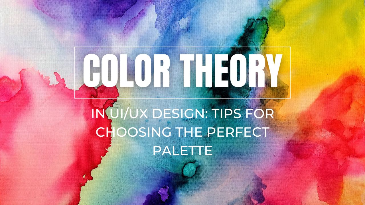
Understanding Color Theory for UX
Color theory is the study of how colors interact and how they affect human perception. In UI/UX design, it helps designers create visually cohesive and emotionally resonant interfaces. Understanding color properties such as hue, saturation, and brightness enables designers to craft balanced and effective color schemes.
1. The Color Wheel and Color Harmonies
The color wheel is the foundation of color theory, consisting of primary (red, blue, yellow), secondary (green, orange, purple), and tertiary colors. Designers use different color harmonies to create balanced interfaces:
- Monochromatic: Uses varying shades of a single color for a minimalist and cohesive look.
- Analogous: Combines adjacent colors on the color wheel for a natural and comfortable appearance.
- Complementary: Uses colors opposite each other on the wheel for a high-contrast and energetic effect.
- Triadic: Three evenly spaced colors for a dynamic yet balanced palette.
Learn More: Adobe Color Wheel
2. Psychology of Colors in UI/UX
Colors evoke emotions and influence user behavior. Here’s how common colors affect UX:
- Blue: Trust, security, and professionalism (used by Facebook, LinkedIn, Twitter).
- Red: Excitement, urgency, and passion (used by YouTube, Netflix, Coca-Cola).
- Green: Growth, harmony, and health (used by WhatsApp, Starbucks, Spotify).
- Yellow: Optimism, warmth, and happiness (used by Snapchat, McDonald’s, IKEA).
- Black & White: Elegance, sophistication, and simplicity (used by Apple, Nike, Tesla).
3. Accessibility and Contrast in UI Design
Building a personal brand isn’t just about self-promotion—it’s about building relationships. Engage with the IT community by participating in forums, attending conferences, and joining online groups. Platforms like Reddit, Dev.to, and Hacker News are great places to share your insights and learn from others.
Networking with peers, mentors, and industry leaders can also help you gain visibility and credibility. Don’t be afraid to collaborate on open-source projects or contribute to discussions on platforms like GitHub.
Learn More: Explore Dev.to to see how developers engage with the community through discussions and collaborations.
Best Practices for Choosing UI Design Colors
4. Define Your Brand Identity
Your color palette should align with your brand’s personality. Ask yourself:
- What emotions should my brand evoke?
- Who is my target audience?
- What industry am I designing for?
For example, fintech apps often use blue for trust and security, while e-commerce sites favor red or orange for urgency and excitement.
Learn More: Canva’s Brand Color Guide
5. Use a Primary, Secondary, and Neutral Palette
A structured approach to UI colors enhances consistency:
Primary Color: The main brand color, used for buttons and highlights.
Secondary Color: Complements the primary color, often used for accents.
Neutral Colors: Backgrounds, text, and secondary elements for balance.
Example: Google uses a blue primary color, red/yellow/green accents, and a white/gray background.
Learn More: Material Design Color System
6. Limit Your Color Palette
Using too many colors can create visual clutter. Stick to:
- 3–5 Core Colors: A primary, secondary, and a few neutral colors.
- Consistent Tones: Ensure uniformity in brightness and saturation levels.
- Functional Colors: Assign colors to specific UI functions, such as red for errors and green for success messages.
Learn More: Apple Human Interface Guidelines
7. Utilize Color Tools and Generators
Designers can leverage color tools to generate harmonious palettes:
- Coolors – Generates random color palettes.
- Khroma – Uses AI to suggest personalized color schemes.
- Material Palette – Provides Google Material Design colors.
Recommended Color Palettes for UI/UX
8. Modern and Minimalist Palette
9. High-Contrast and Bold Palette
For dynamic and attention-grabbing designs:
- Primary: Bright Red (#E74C3C)
- Secondary: Yellow (#F1C40F)
- Accent: Black (#2D3436)
Used by: Spotify, McDonald’s
10. Soft and Pastel Palette
Conclusion
Choosing the perfect color palette for UI/UX design requires an understanding of color theory, psychology, accessibility, and branding. By following best practices and using color harmonies effectively, designers can craft visually appealing and user-friendly interfaces. Whether creating a minimalist, bold, or soothing UI, leveraging tools and inspiration from industry leaders can help refine your choices.
Start experimenting with different palettes today and elevate your UI/UX design with the power of color!


No comment yet, add your voice below!